World Happines Report (WHR) 2017
It is common to find places that shows a map with the happiness score for each country find in the World Happiness Report (WHR). However, the WHR has much more information than just the happiness score. This work is devoted to those underlying reasons that yields (or not) happiness.
The original data is open and free. I keep a copy in Miscellanea/Original data set. For this analysis I only used the data of the year 2016. The features “Democratic Quality”, “Delivery Quality”, “Gini Index”, “Gini Index, average 2000-13” and all the features like “Most people can be trusted…” where not considered.
For the analysis, two hypothetical countries were created, “utopia” and “dystopia”. The former has the best values in the data set for every feature, while the latter has the worst values.
Imputation Process
Many countries have missing values in several features for the year 2016, thhus an imputation procedure must be performed. As a first imputation I used the records of the previous years and averaged them to have an imputed value for those features that are missing. Unfortunately, there are some countries that do not have historical records, so this approach cannot be perform in those. Those countries with no historical records in the missing features where not considered in this first imputed data set.
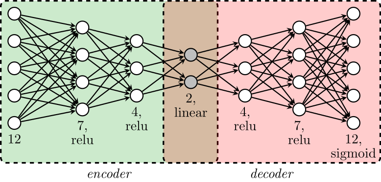
For the countries with all the values of the year 2016 or in those where it was possible to impute the missing values from previous records, the data were standardized so every column has values between 0 and 1. Once the data has been standardized, I train an Autoencoder (AE) (a graphical schema of the AE is possible in the section Data Visualization in Latent Spaces), and its encoder part was used to project the data into a non-linear space of dimension 2.
With the data projected in the latent space of dimension 2, I found the line that best approximate the data using Principal Component Analysis (PCA). The hypothetical countries utopia and dystopia where not used to train the AE or to find the best linear representation of this latent space, but both of them were projected into this final linear representation. Note that this linear representation order the countries with utopia and dystopia been assigned to the edges, with this order I assign an integrated score to each country where utopia has a value equal to 10 and dystopia has a value equal to 0.
At this point, I have a data set with the countries that have values in all the features or that have historical records to easely impute the missing values; and an integrated score was assigned to these countries. However, there are countries with no historical records, that I have kept apart of the analysis. The next step of the imputation process was to predict the integrated score of the latter group of countries. To do so, I constructed a Random Forests (RF), as it is proposed in my PhD dissertation, using the countries with an integrated score, but without imputing the missing values; then I predict the integrated score for the remain countries.
Remember that the integrated score is just a position in a 2-dimensional line in the latent space of the AE. Now that all the countries have an integrated score, we can use the decoder part of the AE, decode all the countries with missing values for the year 2016 and use this reconstruction as the final imputation for our data set. I think that this imputation would be better than simply averaging the previous historical records, since the AE can take into account more complicated non-linear relationships between the countries. The final imputed data set can be found in Miscellanea/Imputed data set
In a nutshell, this is the procedure that I used to impute the data:
- Train an AE and use its encoder part.
- Use PCA in the latent space to asign an 'integrated score' to each country.
- Use a RF to estimate the 'integrated score' of the countries with missing values (as it is proposed in my PhD dissertation).
- Use the decoder part of the AE to impute the missing values.
Visualizations
Maps and Histograms
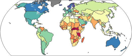
Enjoy the interactive maps, perhaps you would have new insights of the world and your country. I only show the map and histogram for some features, a map and histogram for the rest of features can be found in Miscellanea
Note: For some reason (independent to me) the map does not recognize some states like Kosovo, Somaliland or North Cyprus.
Data Visualization in Latent Spaces
Some comments about the world
We face a huge inequality all around the world, at the same time that Qatar enjoys a GDP of around 136,000 USD per capita, most of the world does not go over 20,000 USD and in Burundi it does not go up to 400 USD. Entire countries in America and Africa with a huge inequality in the household income. Countries without freedom and where the sadness and the anger are the common day. An entire world turn to red when it refers to the perception of corruption or the generosity. However, at the same time that we struggle with all these problems, there are countries that might lead the way to solve them. Like the extraordinary effort of countries like Ruanda or Somalia to fight against corruption, or an America colored with blue when it refers to happiness and enjoyment. And most of the world counting with someone in times of trouble.